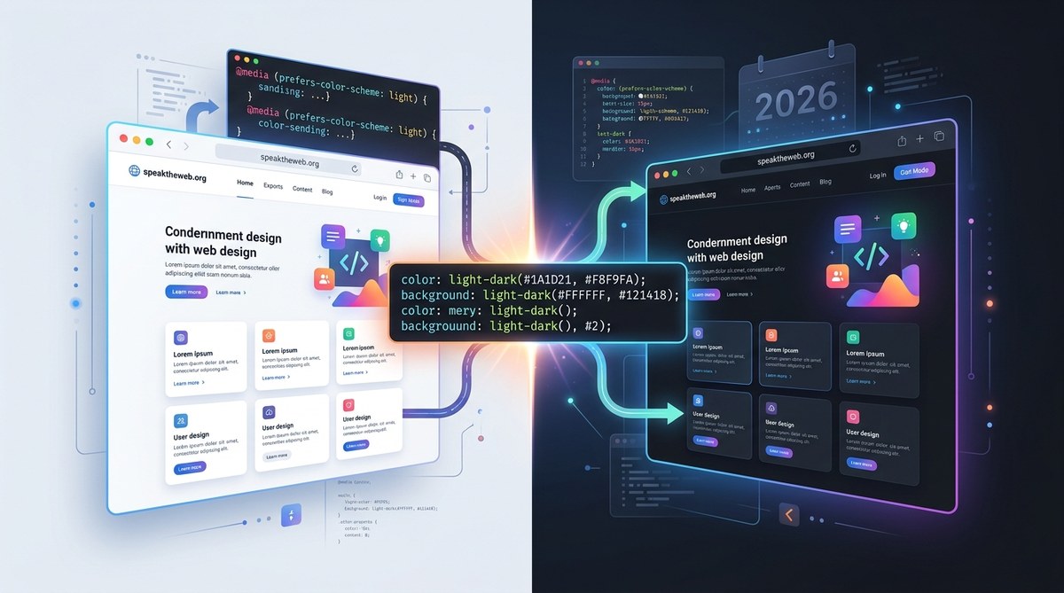
For years, managing dark mode on the web meant writing JavaScript toggle logic, maintaining stacks of CSS custom properties, or relying on a preprocessor to swap entire stylesheets. It worked, but it was never clean. The CSS Working Group noticed, and in 2026 they gave us something better. The new CSS light-dark() function is a native, browser-level tool that lets you define color values that automatically adapt to the user’s preferred color scheme. No more media queries for prefers-color-scheme that force you to rewrite every rule. No more JavaScript toggles that flicker on page load. This function handles the heavy lifting, and it is about to change how you approach theme management.
The CSS light-dark() function accepts two color arguments: the first for light mode, the second for dark mode. It reads the user’s system-level or browser-level color preference and outputs the correct color automatically. This removes the need for custom properties, media queries, and JavaScript toggles for theme switching, making your code leaner and more maintainable.
How the light-dark() function works
The syntax is straightforward. You pass two color values to the function. The first is the light mode color, and the second is the dark mode color. The browser picks the right one based on the user’s current preference.
body {
  background-color: light-dark(#ffffff, #1a1a2e);
  color: light-dark(#222222, #e0e0e0);
}
When a user has their OS or browser set to light mode, the background becomes white. When they switch to dark mode, the background shifts to a deep navy without any extra code on your part. The function works anywhere a color value is valid in CSS. That includes background-color, color, border-color, box-shadow, fill for SVGs, and even gradient stops.
The real power shows up when you pair it with the prefers-color-scheme media query for overrides. You can still use that media query for special cases, but for most color definitions, light-dark() replaces the need for it entirely.
Why this beats custom properties and media queries
Before 2026, the standard approach looked something like this:
:root {
  --bg: #ffffff;
  --text: #222222;
}

@media (prefers-color-scheme: dark) {
  :root {
    --bg: #1a1a2e;
    --text: #e0e0e0;
  }
}

body {
  background-color: var(--bg);
  color: var(--text);
}
That works, but it forces you to manage a separate block of overrides for every component. If you have a large project with hundreds of color tokens, you end up duplicating the entire set inside the media query. The light-dark() function collapses that into a single line per property.
Here is a comparison of the two approaches:
| Aspect | Custom properties + media query | light-dark() function |
|---|---|---|
| Lines of code per color | 3 (declaration, media query override, usage) | 1 |
| JavaScript dependency | Often needed for toggle | None |
| Maintenance burden | High for large projects | Low |
| Browser support (2026) | Full | Full |
| Works with inline styles | No | Yes |
The table shows the clear winner for new projects. You write less code, you avoid the risk of forgetting to update the media query block, and you get automatic theme switching at the browser level.
Common mistakes to avoid
Even with a simpler tool, there are pitfalls. Here are the ones I see most often.
- Forgetting contrast in dark mode. A color that looks great on white might be unreadable on a dark background. Always test both values. A common example is using pure black text on a dark background. Instead, use a lighter gray like
#e0e0e0for dark mode text. - Using the function for non-color properties. The
light-dark()function only works where CSS expects a color value. You cannot use it forwidth,padding, ordisplay. It is not a general purpose conditional. - Overriding with media queries unnecessarily. You can still use
prefers-color-schemefor layout changes or hiding elements, but do not use it to re-declare colors that you already set withlight-dark(). That creates confusion. - Ignoring the user’s system preference. The function respects the OS or browser setting. If you force a toggle in JavaScript that overrides the system preference, you might create a mismatch. Let the browser handle the initial state.
A practical example: building a themed card component
Let me show you a real component that benefits from this function. A simple card with a background, text, a border, and an icon.
.card {
  background-color: light-dark(#f9f9f9, #2a2a3e);
  color: light-dark(#333333, #cfcfcf);
  border: 1px solid light-dark(#cccccc, #555555);
  border-radius: 8px;
  padding: 1.5rem;
}

.card-icon {
  fill: light-dark(#4a90d9, #7ab8f0);
}
That is it. When the user switches their system theme, the card updates instantly. No JavaScript, no custom property cascade, no media query block. The icon fill also adapts, which is a nice touch for SVGs that previously required a separate class or inline style override.
If you want to see how this fits into a broader theme system, check out our guide on building responsive web interfaces with modern CSS Grid and Flexbox techniques. The same principle applies: less code, more adaptability.
When you still need media queries
The light-dark() function is powerful, but it does not replace every use of prefers-color-scheme. You still need the media query for situations where you want to change more than just a color. For example, you might want to swap an image for a dark mode variant, adjust the layout, or hide a decorative element that looks odd in dark mode.
@media (prefers-color-scheme: dark) {
  .hero-image {
    content: url("hero-dark.svg");
  }
  .decorative-line {
    display: none;
  }
}
Think of light-dark() as your default tool for color adaptation. Use the media query only for structural or content changes that cannot be expressed as a color value.
Expert advice: Start your next project by defining all your color tokens using
light-dark()from the start. It is easier than retrofitting later. If you maintain a legacy project, begin by converting your most frequently used colors, like backgrounds and text, and work outward from there. The payoff in reduced code size is immediate.
How to adopt this in your workflow today
If you are ready to start using light-dark() in your projects, follow these steps.
- Check your browser support. As of early 2026, all major browsers support the function. If you need to support older browsers, provide a fallback by declaring the light mode color first and letting the cascade handle it.
- Audit your current theme system. Identify every place where you use a
--varinside aprefers-color-schemeblock. Those are the prime candidates for replacement. - Replace one component at a time. Start with your body background and text color. Then move to cards, buttons, and form fields. Test each change in both modes.
- Remove the media query block for colors once you confirm the function works. Keep it only for non-color overrides.
- Teach your team the new pattern. Add a note to your style guide that all new color definitions should use
light-dark()unless there is a specific reason not to.
This function also pairs well with other modern CSS tools. For example, you can combine it with the color-mix() function for dynamic color generation, or use it inside @layer blocks for complex theming. The CSS spec in 2026 is full of these small quality of life improvements.
If you are looking to modernize your entire frontend toolkit, take a look at our article on 5 new CSS features that will change your workflow in 2026. The light-dark() function is just one piece of a larger shift toward more expressive, native CSS.
The bigger picture for theme management
The light-dark() function is not just a convenience. It signals a shift in how the CSS specification thinks about user preferences. Instead of forcing developers to build workarounds for every OS-level feature, the spec is now providing first class functions that bridge the gap between system settings and web content. This reduces the amount of custom code you need to write, which means fewer bugs and faster load times.
In a world where users expect websites to respect their system preferences without asking, this function is a direct answer. It also makes your code more accessible. Users who rely on high contrast modes or who have visual sensitivities benefit from a site that adapts without friction.
Your next step with light-dark()
The best way to understand this function is to use it. Open a small test project. Create a simple page with a heading, a paragraph, and a button. Style each element using light-dark(). Toggle your system theme between light and dark. Watch the colors change instantly. That moment, when you realize you wrote zero JavaScript and zero media queries for that behavior, is when the function clicks.
Once you feel comfortable, apply it to a real component in your current project. Convert the most visible elements first. The difference in code clarity will be noticeable.
For more on modern frontend patterns, including how this function fits into a larger theme architecture, read our post on unlocking the power of web components for modern frontend development. The combination of native CSS functions and component based design is a powerful one.
Go ahead and give light-dark() a try. It is one of those rare additions to CSS that makes you wonder why it took so long. But now that it is here, use it to simplify your themes and give your users the experience they deserve.