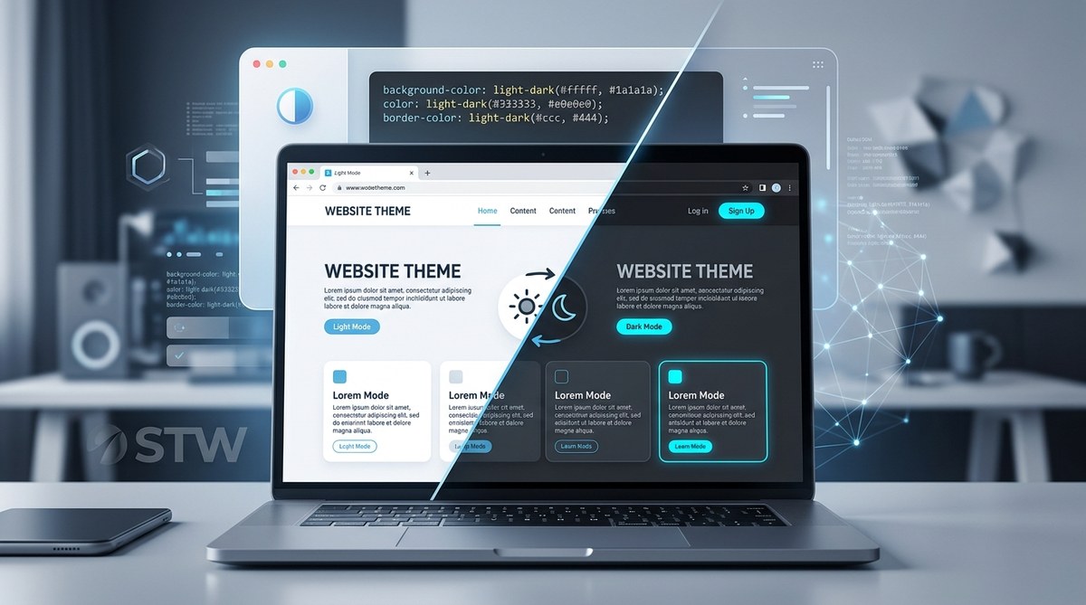
For years, managing dark mode on a website felt like a constant battle. You would write a set of custom properties, sprinkle in some media queries for prefers-color-scheme, and then wire up a JavaScript toggle that flipped a class on the <html> element. It worked, but it was fragile. If you had a component library with its own color tokens, you often ended up duplicating every single variable. The new CSS light-dark() function changes all of that. It is a native CSS function that lets you define a light and a dark value in one single declaration. The browser handles the rest based on the user’s system preference or a manual override. This is not just a syntax shortcut. It is a fundamental shift in how we can build and maintain themes.
The CSS light-dark function lets you pass two color values to a single property. The browser automatically picks the right one based on the user’s color scheme preference. This eliminates the need for separate CSS variables for light and dark modes, reduces the amount of code you write, and makes theme management feel like a first-class feature of the language instead of a hack.
Why the old way was starting to hurt
Before we look at the new function, let’s talk about the pain points of the old approach. The most common pattern in 2025 looked something like this:
:root {
  --bg: #ffffff;
  --text: #1a1a2e;
}

@media (prefers-color-scheme: dark) {
  :root {
    --bg: #0d1117;
    --text: #c9d1d9;
  }
}
That is readable, but it gets messy as a project grows. You need to manage two sets of custom properties. If you have a third theme, like a high-contrast mode, you end up with three copies of every variable. And if you want to let users override the system preference with a manual toggle, you need JavaScript to add or remove a class and then write a third set of selectors. The maintenance cost adds up.
Another issue is component isolation. If you import a widget from a third-party library that uses its own custom properties, you often have to redeclare those variables inside your theme. The light-dark() function solves this at the declaration level, which means it works everywhere a color value is accepted.
How the CSS light-dark function works
The syntax is straightforward. You call light-dark() and pass two arguments. The first argument is the color for light mode. The second argument is the color for dark mode.
body {
  background: light-dark(#ffffff, #0d1117);
  color: light-dark(#1a1a2e, #c9d1d9);
}
When the user’s system is set to a light color scheme, the browser uses the first value. When the system switches to a dark color scheme, the browser uses the second value. No media query. No custom property. No JavaScript.
You can use any valid CSS color value inside the function. Named colors, hex codes, rgb(), hsl(), oklch(), and even other CSS functions are all fair game.
.card {
  border-color: light-dark(hsl(210, 15%, 85%), oklch(0.45 0.08 250));
}
The function respects the user’s color-scheme property on the element. If you set color-scheme: dark on a specific container, the light-dark() function inside that container will use the dark value, regardless of the system setting. This is how you build manual toggles without JavaScript.
Building a manual theme toggle with light-dark()
One of the biggest surprises for developers is that you can create a user-facing toggle without writing a single line of JavaScript. The trick is to use the color-scheme property on the root element and let light-dark() do the switching.
Here is a step-by-step process:
- Set the default
color-schemeon the<html>element using thestyleattribute or a meta tag. This lets the browser know that your page supports both themes.
<html style="color-scheme: light dark;">
- Use
light-dark()for every color value in your stylesheet. This replaces all your custom property pairs and media queries.
:root {
  --surface: light-dark(#f5f5f5, #1e1e2f);
  --accent: light-dark(#2563eb, #60a5fa);
}
- Add a toggle button that switches the
color-schemevalue on the<html>element.
<button onclick="toggleTheme()">Switch theme</button>
That is it. The light-dark() function reads the color-scheme of the element and picks the correct value. You do not need to swap classes, reload custom properties, or recompile anything.
Common mistakes and how to avoid them
The function is simple, but there are a few traps that developers fall into when they first adopt it.
| Mistake | Explanation | Fix |
|---|---|---|
Forgetting to set color-scheme on the root |
Without this, the browser may default to light mode and ignore the function entirely. | Add color-scheme: light dark; to the <html> element. |
| Passing only one argument | The function expects exactly two color values. A single value will cause the declaration to be invalid. | Always provide both a light and a dark value. |
Using light-dark() inside a media query |
This creates unnecessary nesting and can lead to specificity conflicts. | Use light-dark() at the property level. The media query is no longer needed. |
| Applying the function to non-color properties | light-dark() only works with CSS properties that accept color values. Using it on width or padding will not work. |
Use custom properties for non-color values that need to change between themes. |
Real-world example: a card component
Let’s put together a practical example. Imagine you have a product card that needs to look good in both themes. With the old approach, you would write two sets of custom properties and hope that the component respects them. With light-dark(), the component becomes self-contained.
.product-card {
  background: light-dark(#ffffff, #1a1a2e);
  color: light-dark(#333333, #e0e0e0);
  border: 1px solid light-dark(#d1d5db, #4b5563);
  box-shadow: 0 2px 4px light-dark(rgba(0,0,0,0.1), rgba(0,0,0,0.6));
}

.product-card__title {
  color: light-dark(#111827, #f3f4f6);
}

.product-card__price {
  color: light-dark(#059669, #34d399);
}
This component can be dropped into any page, regardless of whether that page uses custom properties or not. The theme adaptation is built into the component itself.
“The
light-dark()function is the first CSS feature that makes theme-aware components feel like a natural part of the language. You no longer need to architect your entire design system around dark mode. You just write the colors and move on.” — Miriam Suzanne, CSS spec editor
What this means for your workflow
Adopting light-dark() changes how you structure your CSS files and how you think about theming. Here are the main benefits:
- You write less code. A single
light-dark()call replaces what used to require a custom property and a media query override. - Your stylesheets are easier to read. The theme logic lives right next to the property it affects, not in a separate block at the top of the file.
- You reduce JavaScript dependencies. Many sites use JavaScript solely for theme toggling. With
light-dark(), you can handle that with a single line of inline script or even a “ tag. - Component libraries become portable. A component that uses
light-dark()will adapt to the host page’s theme without any configuration.
If you are already using custom properties for theming, you can mix them with light-dark().
:root {
  --primary: light-dark(#1d4ed8, #3b82f6);
  --surface: light-dark(#f9fafb, #111827);
}
This gives you the flexibility of custom properties with the automatic switching of the new function.
Browser support and fallback strategy
As of mid-2026, the light-dark() function is supported in all major browsers. Chrome, Firefox, Safari, and Edge have all shipped it. If you need to support older browsers that do not recognize the function, you can provide a fallback using the color-scheme media query or by defining a default value before the light-dark() call.
.card {
  /* Fallback for older browsers */
  background: #ffffff;
  /* Modern browsers will use this */
  background: light-dark(#ffffff, #1a1a2e);
}
Browsers that do not understand light-dark() will ignore the second declaration and use the fallback. Browsers that do support it will apply the second rule, which overrides the first due to source order.
When to keep using the old approach
The light-dark() function is powerful, but it is not a silver bullet. There are still cases where you might prefer the traditional media query approach.
- If you need to change more than just color values between themes. For example, if you want to swap an image or change a font weight,
light-dark()will not help because it only works with color properties. - If you are working with a design system that uses a large number of custom properties and you want to keep a single source of truth. You can still use
light-dark()inside the custom property value, but some teams prefer the explicitness of separate variable sets. - If you need to support more than two themes. The function only handles light and dark. For high-contrast, sepia, or other specialized modes, you still need a different strategy.
For most projects, though, light-dark() will become the default way to handle color theming. It is simpler, more maintainable, and aligns with how the web platform is evolving.
Putting it all into practice
The best way to understand the CSS light-dark function is to use it in a real project. Start with a small component, like a button or a card, and replace your existing custom property pairs with light-dark() calls. Then remove the media query block that handled dark mode. You will see the code shrink immediately.
After that, experiment with the manual toggle approach. Add a button that switches color-scheme on the root element and watch the entire page adapt without any extra CSS. It is a satisfying feeling.
For more on modern CSS techniques, check out our guide on 5 new CSS features that will change your workflow in 2026. You might also find our article on how to use CSS container queries for true component-level responsiveness in 2026 useful for building truly adaptive interfaces.
The future of theme management is already here
The light-dark() function is not a flashy new toy. It is a practical tool that solves a real problem that front-end developers have been dealing with for years. It removes friction from the development process and makes the web feel more native for users who prefer dark mode. If you have not tried it yet, add it to your next project. You will wonder how you managed themes without it.