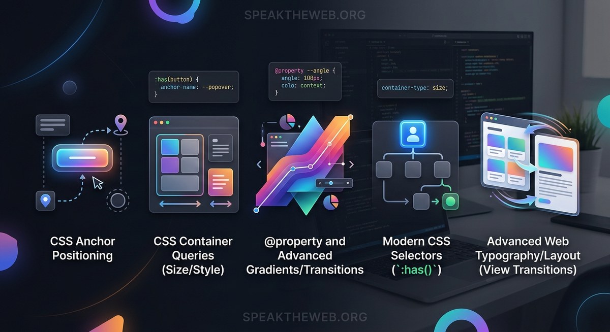
CSS keeps surprising us. Every year brings tools that make frontend work feel less like fighting the browser and more like building with intent. In 2026, five new CSS features stand out. They remove JavaScript hacks, reduce boilerplate, and give us control we only dreamed of a few years ago. If you style web pages every day, these features will change how you write code.
In 2026, CSS removes the need for JavaScript in five critical areas: scroll animations, element entry effects, tooltip positioning, sibling styling, and data-driven design. By adopting scroll-driven animations, @starting-style, the anchor positioning API, sibling-index(), and advanced attr(), you can drop hundreds of lines of JS and build faster, more maintainable interfaces. This article shows you how each feature works and where to apply them today.
Scroll-Driven Animations: Animate Without a Library
Tying animation to scroll position used to mean reaching for Intersection Observer, requestAnimationFrame, or a third-party library. The new scroll-driven animations API lets you define these directly in CSS. You can animate elements as they enter the viewport, respond to a scroll container’s progress, or link motion to a timeline.
Here is a basic example that fades in a card as the page scrolls:
@keyframes fade-in {
  from { opacity: 0; transform: translateY(20px); }
  to   { opacity: 1; transform: translateY(0); }
}

.card {
  animation: fade-in auto linear;
  animation-timeline: view();
}
The view() timeline triggers the animation based on the element’s visibility. No JavaScript required. For a deeper look at combining these with JavaScript for complex scenarios, check out our guide on Master Modern Web Animations with CSS and JavaScript Techniques.
How to Use Scroll-Driven Animations in Your Project
Follow these steps to get started:
- Decide what triggers the animation – use
view()for scroll visibility,scroll()for a container’s scroll track, ordocumentfor the page timeline. - Write a standard
@keyframesrule – the same syntax you already know. - Set
animation-timelineto the trigger – this replaces the defaultauto(time-based) timeline. - Adjust
animation-range– control when the animation starts and ends relative to the element or scrollport. - Test across browsers – currently supported in Chrome 115+, Edge 115+, and Firefox 128+. Safari has partial support with flags.
Benefits of Scroll-Driven Animations
- Remove all scroll-listener JavaScript
- Smooth performance because the browser handles frame timing
- Easy to combine with other animation properties like
animation-delayandanimation-fill-mode
@starting-style: Animate Elements When They Appear
Animating the entrance of an element added dynamically (for example, a modal or a new list item) was always tricky. You had to wait for the next frame, force a reflow, or use a library. The @starting-style rule lets you define the initial state of an element before its first style update. This means you can animate from opacity: 0; transform: scale(0.8) to the full style smoothly.
.modal {
  transition: opacity 0.3s, transform 0.3s;
  opacity: 1;
  transform: scale(1);
}

@starting-style {
  .modal {
    opacity: 0;
    transform: scale(0.8);
  }
}
When the modal is inserted into the DOM, it starts at the @starting-style values and animates to the normal state. No extra JavaScript.
Expert advice: “
@starting-styleis perfect for notification toast messages and drop-in panels. Combine it withdisplay: nonetoggling via:popover-openor a class, and you get polished entry animations with zero JS.” – Sarah Chen, senior frontend engineer
Common Mistakes and Best Practices
| Mistake | Best Practice |
|---|---|
Applying @starting-style to elements that are already visible |
Only use for elements that start hidden or are dynamically added |
Forgetting to set a transition on the target properties |
@starting-style only defines the starting values; transitions or animations must be present |
Using @starting-style with animation instead of transition |
It works with both, but transition is simpler for single entry effects |
| Not testing in Firefox (stable support arrived in 128) | Check caniuse.com for the current status |
For more on building accessible components that use entry animations, see our article on How to Build Accessible Web Components That Everyone Can Use.
Anchor Positioning: Tooltips and Popovers Without JavaScript
Positioning one element relative to another – think tooltips, dropdowns, or popup menus – used to require a JavaScript position engine. The CSS anchor positioning API lets you do this declaratively. You define an anchor element with the anchor-name property and then position a target element relative to that anchor.
.anchor {
  anchor-name: --my-anchor;
}

.tooltip {
  position: absolute;
  position-anchor: --my-anchor;
  top: anchor(--my-anchor bottom);
  left: anchor(--my-anchor left);
  /* or use the logical shorthand */
  inset-area: bottom;
}
The inset-area property simplifies common placements: top, bottom, left, right, and their combinations. This feature is part of the larger web component ecosystem and works hand in hand with the popover API.
sibling-index() and sibling-count(): Style Elements by Their Position in a Set
You could always style the first or last child, but styling the third, fifth, or any specific sibling required nth-child formula gymnastics. The new sibling-index() and sibling-count() functions give you direct access to the element’s index and the total number of siblings in the same parent.
li {
  background: hsl(calc(sibling-index() * 30deg), 70%, 70%);
}

li:first-of-type {
  --size: sibling-count();
}
Sibling-index() returns a number starting at 1, so you can use it in calc() for staggered animations, color scales, or progress bars. Sibling-count() is especially useful when you need to set container dimensions based on the number of items – for example, making a grid column span all siblings.
- Generate rainbow colors without a preprocessor:
hsl(calc(sibling-index() * 60deg), 70%, 60%) - Create staggered delays in animations:
animation-delay: calc(sibling-index() * 0.1s) - Build fluid layouts where each item knows its total:
flex-basis: calc(100% / sibling-count())
Advanced attr(): Data-Driven Styling Without JavaScript
The attr() function existed for years but only returned strings. In 2026, browsers support type parsing for attr(), allowing you to extract attributes as numbers, colors, lengths, or other CSS types. This means you can embed styling data directly in HTML and use it in CSS without a custom property or JavaScript.
<div data-score="85" data-color="#3498db">Score: 85</div>
div {
  width: attr(data-score px, 0px);
  background: attr(data-color color, #eee);
}
The second parameter is the fallback value. This is a game-changer for data visualizations, theming, and component libraries. Instead of writing JS to set inline styles, you let the browser read the attribute.
- Perfect for progress bars, star ratings, and charts
- Works with all CSS types:
<length>,<color>,<number>,<percentage>,<angle> - Reduces the need for inline
styleattributes in dynamic templates
For a broader view of how these and other top trends in frontend frameworks for 2026 interact, our team has a roundup of what’s shaping modern web building.
How to Bring These Features Into Your Daily Work
The best way to adopt new CSS is to start small. Pick one feature that solves a current pain point – maybe anchor positioning replaces a JavaScript tooltip library, or scroll-driven animations remove an Intersection Observer script. Follow this process:
- Audit your existing code for places where these five features can replace JavaScript or workarounds.
- Use progressive enhancement – the features degrade gracefully. For example, scroll-driven animations do nothing in unsupported browsers, so your page still works.
- Enable fallbacks with media queries or
@supportsrules. For@starting-style, you can provide a basic state that appears without animation. - Test in the latest versions of Chrome, Edge, Firefox, and Safari. The web continues to move toward web components and modern HTML, so keeping your browser up to date matters.
- Refactor iteratively – there is no need to rewrite everything at once. Replace one component this week, another next week.
The Future of CSS Is Here, and It’s Practical
Each of these five features proves that the CSS working group listens to what developers actually build. Scroll-driven animations make parallax and progress bars trivial. @starting-style cleans up entry effects. Anchor positioning kills the need for floating UI libraries. sibling-index() simplifies pattern generation. And advanced attr() lets HTML hold its own styling data.
Take a moment this week to try one of them in a small project. Open your browser’s dev tools, write a @starting-style block, or add an anchor name to a button. You will feel the difference: less code, fewer bugs, more time to focus on the user experience.
The language of the web keeps getting better. It is up to us to use it.