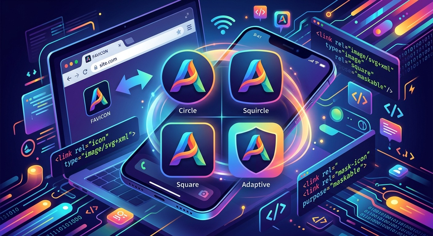
A single PNG favicon worked fine in 2015. Today the situation is considerably more fractured. Your browser tab, your Android home screen launcher, Safari on iOS, and the Chrome PWA installer all consume icons differently. Hand all four of them the same 32×32 PNG and at least one of them will render it blurry, cropped, or missing entirely. The fix is not a bigger sprite sheet or a longer list of <link> tags pointing to dozens of PNGs. It is a smarter, smaller set of formats built for the platforms that actually matter in 2026.
Modern icon delivery requires three distinct formats working in concert.
- An SVG favicon with embedded
prefers-color-schememedia queries adapts automatically to light and dark mode in every supporting browser. - Maskable PNG icons give PWA installers a full-bleed canvas that fits any platform shape, from circles to squircles to rounded squares.
- A web app manifest
iconsarray that declares bothpurpose: "any"andpurpose: "maskable"covers every install path without duplication.
Why a Single PNG Favicon Falls Short
The <link rel="icon" href="favicon.png"> pattern has been around long enough that most developers treat it as a solved problem. It is not. Chrome on Android ignores it entirely when installing a PWA. Safari on macOS prefers a higher-resolution source. Windows taskbar pinning reaches for the manifest icons array. The browser tab renders a 32×32 pixel version, and on high-DPI screens a 32×32 PNG looks visibly soft.
Each platform uses the icon differently because each one has a different job. A taskbar pin needs a contained icon with transparency. A home screen install on Android needs a full-bleed image the OS can mask into whatever shape the launcher prefers. A browser tab needs something that renders crisply at tiny sizes. No single raster image satisfies all three constraints simultaneously. That is why a pipeline built around distinct formats for distinct contexts is the right approach.
The vector-first approach changes the picture entirely. An SVG favicon scales to any size without quality loss and can carry display logic inside itself. That makes it the correct starting point for everything that follows.
SVG Favicons with Dark Mode Built In
The most impactful upgrade you can make right now is replacing your PNG favicon with an SVG version. Browser support is strong across Chromium, Firefox, and Safari. The declaration is minimal:
<link rel="icon" href="/favicon.svg" type="image/svg+xml">That alone gives you a scalable icon. The real payoff comes when you embed a CSS media query directly inside the SVG file. This lets the icon respond to the user’s system color scheme without any JavaScript or extra asset requests.
<svg xmlns="http://www.w3.org/2000/svg" viewBox="0 0 32 32">
  <style>
    @media (prefers-color-scheme: dark) {
      .icon-bg { fill: #0f172a; }
      .icon-fg { fill: #f8fafc; }
    }
    @media (prefers-color-scheme: light) {
      .icon-bg { fill: #ffffff; }
      .icon-fg { fill: #0f172a; }
    }
  </style>
  <rect class="icon-bg" width="32" height="32" rx="4"/>
  <path class="icon-fg" d="M8 8h16v16H8z"/>
</svg>
When the user’s OS switches to dark mode, the browser re-evaluates that media query and the favicon updates without a page reload. A white favicon sitting in a dark browser toolbar stands out immediately as an oversight. This technique eliminates that problem at the source.
Keep the SVG lean. Strip out editor metadata from Illustrator or Figma before serving the file. A favicon SVG should sit well under 2KB. Bloated source files add overhead on every single page load, across your entire user base, for an asset that renders at 16 or 32 pixels.
Building the Web App Manifest Icons Array
The SVG favicon handles your browser tab cleanly. It does nothing for PWA installs. For those, the browser reads your web app manifest and looks for the icons array. The W3C’s app manifest specification defines what values the purpose field accepts and how each one affects install behavior at the OS level.
The two values you need are "any" and "maskable". An icon with purpose "any" is rendered as-is, with transparency preserved. An icon with purpose "maskable" tells the browser the image is designed to be cropped into a shape, with all important content contained inside a defined safe zone.
A minimal manifest icons array that covers modern installs looks like this:
{
  "icons": [
    {
      "src": "/icons/icon-192.png",
      "sizes": "192x192",
      "type": "image/png",
      "purpose": "any"
    },
    {
      "src": "/icons/icon-512.png",
      "sizes": "512x512",
      "type": "image/png",
      "purpose": "any"
    },
    {
      "src": "/icons/icon-maskable-512.png",
      "sizes": "512x512",
      "type": "image/png",
      "purpose": "maskable"
    }
  ]
}
Some developers apply both "any" and "maskable" to the same file using a space-separated string. That technically validates, but a maskable canvas has padding baked into its design, so it looks off when used as a regular icon. Separate files give you full visual control over each context.
The Safe Zone Every Maskable Icon Needs
A maskable icon is a full-bleed image. The OS crops it into a shape, and the shape varies by device and launcher. A Pixel phone might use circles. A Samsung launcher might use squircles or rounded rectangles. You have no control over which shape the user’s device applies.
The spec defines a safe zone as the central 80% of the image diameter. Anything inside that boundary is guaranteed to be visible regardless of what shape the OS applies. Anything in the outer 20% ring may get cropped. That outer ring should contain only your background color, nothing more.
Practically: if your canvas is 512×512 pixels, the safe zone is a circle with a radius of roughly 204 pixels, centered at 256×256. Your logo, wordmark, or primary mark must fit comfortably inside that circle. Fill the entire 512×512 canvas with a solid background that matches your brand color, with no transparency. Transparent maskable icons break visibly on launchers that apply dark or colored shapes behind the icon.
Tools That Generate Each Required Format
Generating these formats by hand from scratch is tedious and error-prone. A focused, ordered sequence of steps gets you to a complete, verified set without the usual back-and-forth:
- Start with a 1024×1024 master SVG. This is your single source of truth. Every raster format gets exported from this file. Keep it in version control so the pipeline stays reproducible across the team.
- Create the favicon SVG separately. Strip it down to the minimal paths needed for legibility at 16px, then add your
prefers-color-schememedia query block. This file should not share complex paths with your master SVG if those paths become unreadable at tiny sizes. - Export PNG sizes from the master SVG. You need 192×192 and 512×512 for the manifest, plus a 180×180 version for the Apple touch icon. Tools like sharp in a Node.js build script handle this conversion cleanly from a vector source without quality loss.
- Create the maskable variant using Maskable.app. This browser-based preview tool shows how your icon looks under different crop shapes before you export the final PNG. Use it to confirm the safe zone is respected on both circular and squircle masks before committing to the file.
- Place a
favicon.icoin your site root. Legacy browsers, RSS readers, and some search engine contexts still reach for it. A 32×32 ICO adds almost no weight and prevents a 404 on a path that many clients will request regardless of your declared<link>tags.
If you use Vite, webpack, or a similar build tool, consider automating the PNG export step as part of your production build. A build-time script that regenerates raster formats from the SVG master keeps outputs synchronized without manual re-exports after every brand update. That one-time setup pays off across every future release.
What Each Format Gets Used for Across Platforms
Icon Formats and Their Consumers by Context
| Format | Used by | Key requirement |
|---|---|---|
favicon.svg |
Chrome, Firefox, Safari browser tabs | Embedded CSS with prefers-color-scheme for dark mode adaptation |
favicon.ico |
Legacy browsers, RSS readers, crawler displays | 32×32 minimum; must live in the site root, not a subdirectory |
apple-touch-icon.png |
iOS Safari bookmarks and home screen saves | 180×180, no transparency; iOS applies its own corner rounding |
Manifest icon, purpose: "any" |
PWA splash screens, Windows taskbar pins | 192×192 and 512×512 PNG; transparent background is acceptable |
Manifest icon, purpose: "maskable" |
Android home screen PWA installs | 512×512, full bleed, primary mark inside the 80% safe zone |
Checking Every Box Before You Ship
Once you have generated your icon set and wired everything into your HTML and manifest, verification still matters. It is easy to reference a wrong path, forget to update a size declaration, or produce a manifest that passes syntax validation but breaks the install experience on a specific device class.
Before pushing to production, work through a structured favicon checklist to confirm that every expected format and size is present and correctly referenced. These checklists surface things that produce no console errors but do cause broken experiences, like a missing 512×512 PNG that forces Chrome to fall back to a low-resolution icon during install, or an SVG favicon served without a proper MIME type declaration that some browsers silently ignore.
Beyond checklists, open Chrome DevTools and inspect the manifest panel to confirm all icons resolve correctly. Install the PWA locally on an Android device or emulator and check the home screen result. Safari’s behavior on iOS differs from Chrome’s on Android in a few meaningful ways, so test both platforms if your audience spans them. Lighthouse audits surface some manifest issues, but they do not catch visual problems like an off-center logo or a brand mark that bleeds into the maskable crop zone.
Your Icon Pipeline Is a First Impression You Only Set Up Once
The favicon is the smallest version of your brand that most users ever see. It appears every time someone has your app open in a tab, every time they glance at their phone’s home screen, every time they switch between open applications. Getting it wrong is subtle, but that subtlety accumulates. A pixelated or miscolored icon in a row of crisp, adaptive ones signals something careless about the product behind it.
The pipeline described here is not large. One SVG favicon with dark mode support. One Apple touch icon at 180×180. Two PNGs for your manifest covering both any and maskable purposes. A legacy ICO in the root. That is the complete set. The total additional weight is measured in kilobytes. The return is an icon that looks deliberate and polished on every platform that will ever try to display it, from a pinned desktop shortcut to an Android launcher running a shape mask you will never see in your own dev environment.
Build the pipeline once, automate the generation step in your build process, and verify it before each release. You will never need to think about it again during a ship. That is effort genuinely well spent on one of the most consistently visible pixels in your entire interface.